
Free free to reach out to me through the channels below.

CRM Mobile App
Recruiters and account managers use the mobile app to work on the go.

Bullhorn is the leading ATS (Application Tracking System) and CRM (Customer Relationship Management) software for staffing agencies.
Recruiters use it to source, track, and communicate with candidates during the hiring process.
Account managers use it to manage their relationships with clients and hiring managers.
Staffing firms' users travel often and they need a good mobile experience when on the go. Before this mobile app, they primarily used Bullhorn's mobile site, a mere reduction of the web app, which was designed with few considerations given to the unique needs of users who are out of the office.
As the sole owner of UX of the product, the deliverables I produced include:
Interactive Prototype
Usability Testing
Product Strategy
Development Handoff
Design QA
User Research
User Flow
Information Architecture
Wireframes
Mockups

Account Manager - Mary
Mary is on the way to her monthly check-in with a client at ACME Company. To prepare for the meeting, she needs to find out whether her firm has candidates on active placement there and if there are current openings.
During the meeting, her client says they are hiring a software developer who should be experienced in JAVA. Mary wants to give him a general idea of her candidate pool and show off some high-quality candidates.
The client chooses her firm to handle the open position. She needs to document the requirement and send it back to the recruiters she works with to begin screening candidates as soon as possible.

Recruiter - John
John is waiting for his candidate Wei at Starbucks for an informal interview. Wei is 5 minutes late, so John needs to find his phone number to check if he is on his way.
During the meeting, John needs to have Wei’s resume at hand to ask relevant questions.
After the meeting, John needs to document Wei’s job preferences and immediately submit him to appropriate job openings before he forgets.
Find critical information, and perform key actions quickly to ensure successful meetings with clients and candidates.
Irrelevant information overwhelms the key information and actions that are most crucial to meetings
Difficult to find a correct record on a small screen, especially if they are looking for a person with a common name or a position with common title
Users forget tasks and meetings often; current mobile site can't send alerts
Based on the research, we decided that just a more user-friendly mobile experience is not enough. We came up with 2 additional functionalities exclusively for the mobile app.
Today - A feature that that predicts what users need right here right now. For example, an upcoming meeting with a candidate will be listed here with all associated records at hand. Within a handful of taps, a user can call the candidate, pull up the resume and add notes.

Final design of the "Today" feature
Calls - The feature looks at the user’s call log and reminds them to take notes about these calls so they become a public record within the team.

Final design of the "Calls" feature
The "Calls" feature doesn’t directly address the needs of users. Instead, it focuses on the needs of the businesses where users work. For each user research project that would impact the business, I always interview a couple of business owners and system admins to understand the business’ perspective and ensure our product benefits their bottom line.
Then for the regular CRM part, the experience is optimized based on the use cases we summarized during research.
Part of the IA document.
Due to the shortage of development resources, this app was built as a hybrid app, meaning it's essentially a web app with a native wrapper. What it meant for me is that I couldn't design system-specific experiences for each platform. Android and iOS users would see the same version of the app.
The good news is, all Bullhorn mobile users do have one app they use several hours a day - the Bullhorn web app. if I use patterns similar to the web app, it doesn't take long for users to figure it out, even though it's not how most of their mobile system apps work. So that's exactly what I did.
When I did have to pick a mobile specific pattern for which there is no similar patterns on the web app, I picked the one that makes the most sense either through looking at the context, or testing with real users from each platform.
On the web app, the navigation system has a flat organization, with all menu items on the same level. In some early iterations, I tried to keep the same paradigm using the material design's drawer component.
Through review and testing, I opted out of this approach because:
This app doesn't necessarily have a home screen. I want users to be able to discover and switch to another section of the app REALLY easily.
Because records are are interlinked, users can jump from one record to the next hundreds of times. There needs to be a way for them to easily go back to the beginning, or to switch to another section of the app.
A small number of users weren’t aware that the hamburger icon triggers the menu
I tried out a few of different ideas and finally landed with a hybrid approach, with elements drawn from both iOS and material design paradigms, while keeping it visually similar with the web app.
On the web app, all filters are visible on the search results page. To move that experience to a small mobile screen, my first approach is putting all filters on a separate page, launched by tapping on the filter icon in the search bar.
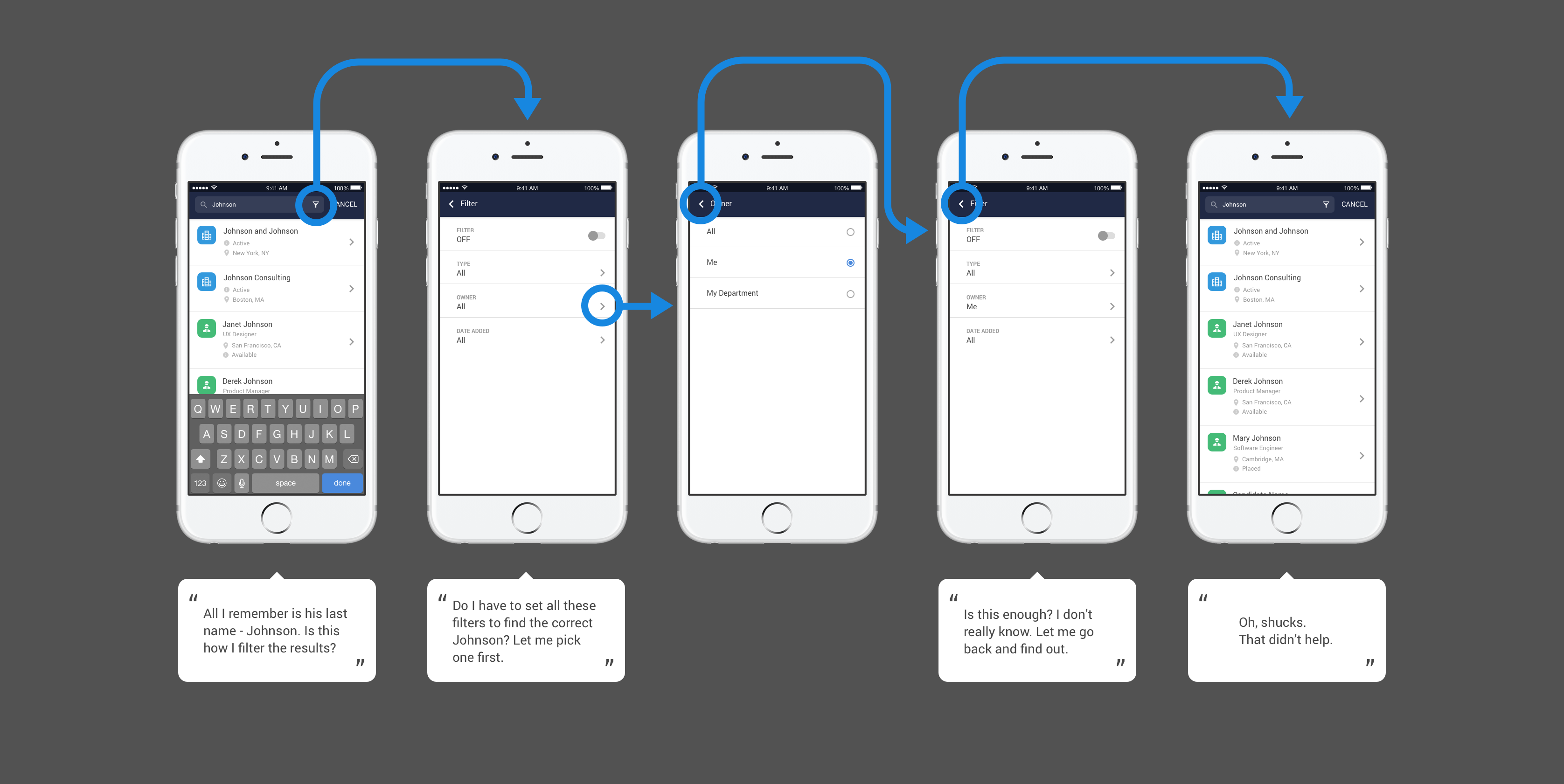
Through testing and review, I found that:
Not all users understand the icon. One user actually told me she thought it was a wine glass.
Users don’t know which, or how many, filters to use to find the record they want to find, so they go back to the search results every time they fill out a filter, which causes a lot of back and forth. Or they fill out all filters, which does narrow down the number of search results, but using all the filters is unnecessary most of the time. Either way, it’s a time consuming and frustrating task.
Users can’t see which filters are applied and less context creates a worse experience.
After more sketching and research on search patterns on other mobile apps, I landed on the final design:
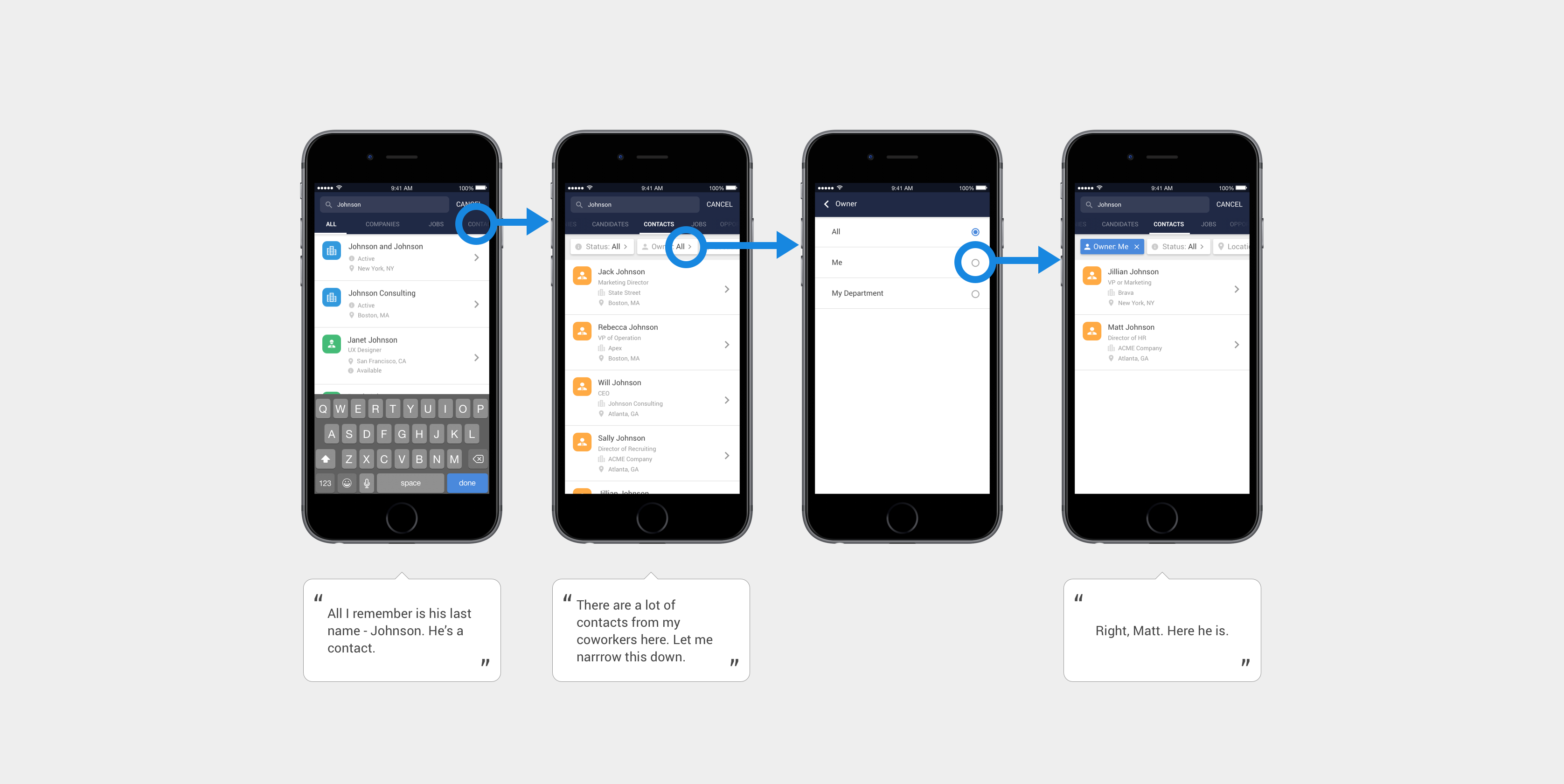
It guides users to pick the record type first, which has the best chance of being the only filter they need
All other filters are laid out right on the search screen as chips so you can see the updated results right away after applying each filter. This progressive approach prevents unnecessary and excessive filtering.
Users can easily see which filters are applied and change them easily.
There is a widget in the users' dashboard on the web app. It tracks a user's phone conversations with their clients and candidates, which is a selling point because users don't have to log these calls manually if they have the app.
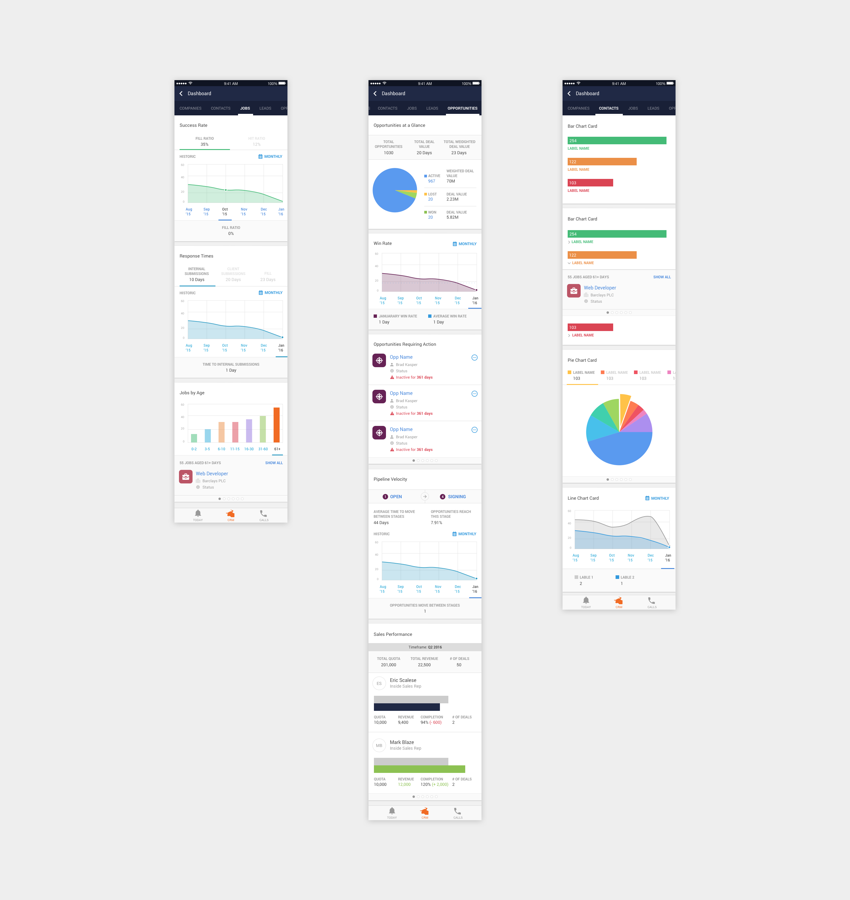
After MVP, we planned to add a dashboard feature, for which I designed a dozen types of data visualization.
I also explored animation for the onboarding screens.


I owned the redesign of the CRM record overview, where users locate and edit all information related to a record.

Salespeople use this product to develop new relationships in potential client companies.

CRM System admins create automations with this tool, to eliminate human errors, keep data in CRM clean and up-to-date.

Users use this web app to pay for invoices, manage their subscriptions and account information.